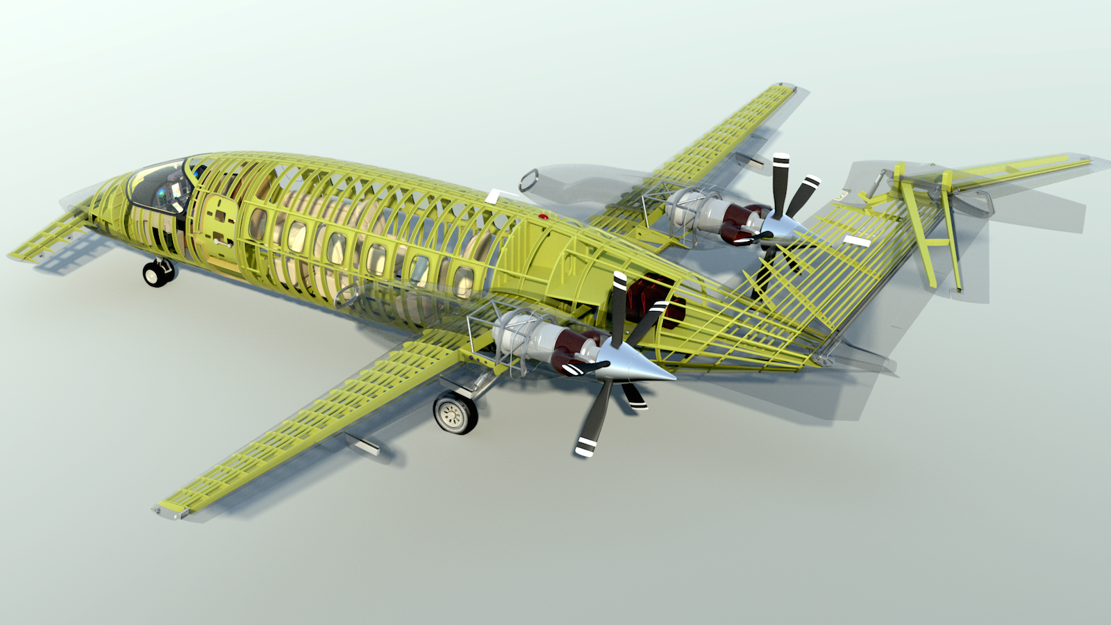
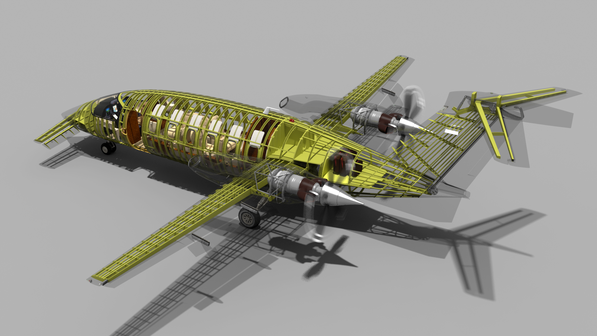
NOTE: I am not at liberty to redistribute the documentation used to build this model.
"Unclamped" Rendering in MODO
When you're doing mostly outdoor or brightly-lit renders, you can easily get away with rendering things in MODO's default "clamped" mode, and still produce nice images. Often, these are a bit faster as well, because MODO is evaluating a somewhat narrower dynamic range. So, if you're in a hurry, this might be the way to go. But, there are steps you can take to improve the depth of your renders, and that involves a bit more work.
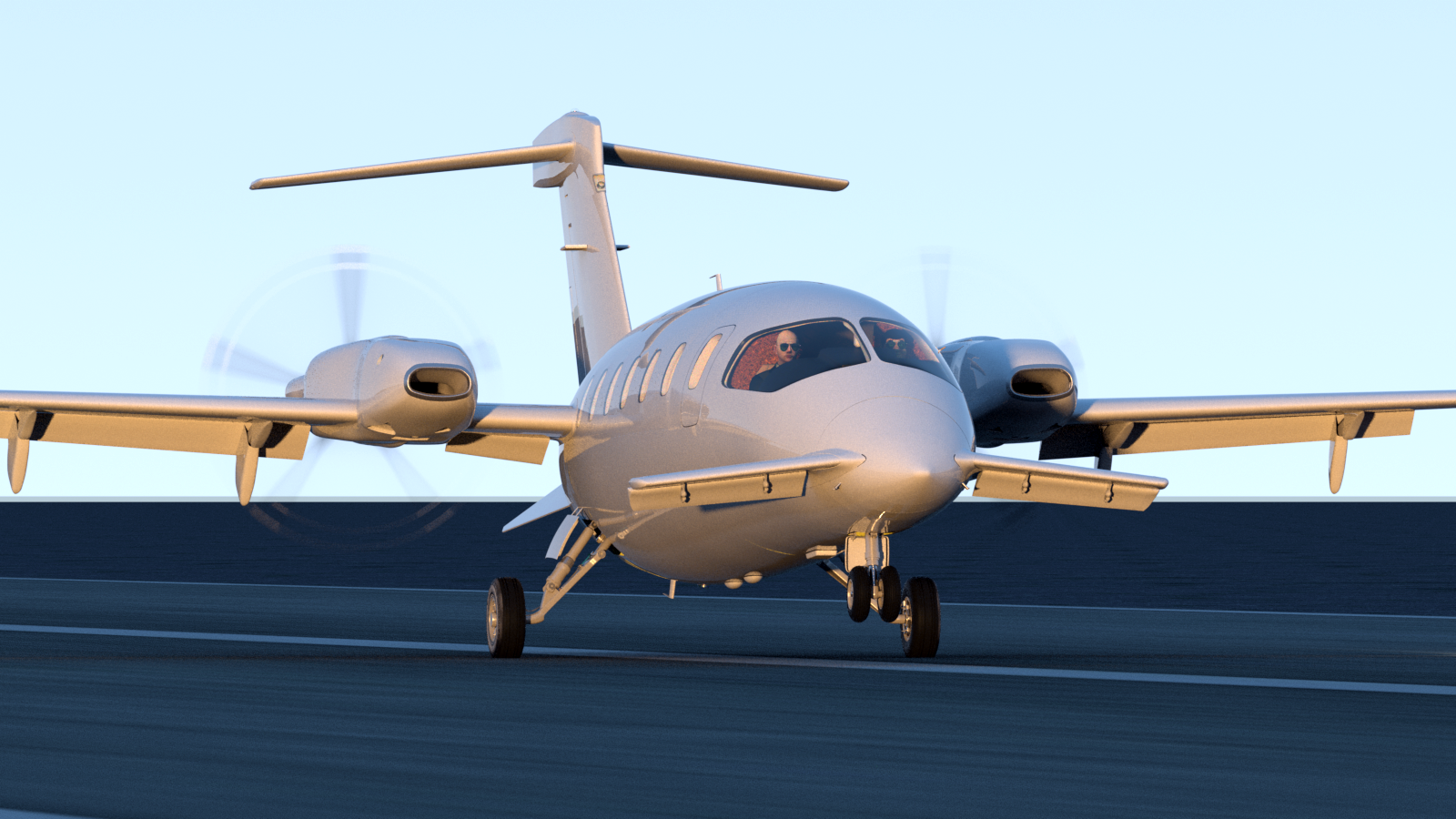
As you may have noticed on the previous page, I've mostly switched to rendering in "unclamped" mode in MODO. This provides a full dynamic range to your images, which in turn gives you greater contrast without screwing up the mid tones, which is obviously a good thing.
There are a few things you need to do, to make this effective:
First, if you're using MODO 801, then realize that it's new color management system doesn't take effect immediately when you open a 701 or earlier scene in 801. You must go Preferences, and set up the defaults. (See the documentation on Color Management for details, and a good set of defaults.) Then, click the "Scene Item" in your Item list, (the top one, which contains the title of the file) and adjust the things in the Settings tab which will appear on the right side of the UI, to match. Finally, look at the top of the Render Preview window, and set the "LUT" (Look-up Table) to one of your defaults. "srgb works well with typical settings. Everything else below works the same in 701 or earlier.
- If you're using a Physical Sun, set clamping to "None"
- In the Shader Tree, highlight the Render Output, and uncheck the "Clamp Colors" box.
- Highlight your Environment Material, and uncheck the "Clamp Sky Brightness" box.
- If you've gotten in the habit, while rendering in clamped mode, of setting the main Directional Light or Physical Sun's brightness to something like "3", then you may find that you need to raise it to 4 or 5.
Having done those things, you'll probably see your render preview window change to a horribly "blown-out" look that's far too bright. Don't panic... Until you start to adjust some things, that's normal. There area a couple of other settings that will get you closer to what you expect. If you're using a background image in your environment, you may have to adjust it's High Value. (Some of my non-HDR images had to be raised to 500% or more, to look right.) You may also want to select your Render Output item, and raise it's "Input White Level". Start small, raising it to say, "5". Some scenes might require raising higher, to something like 15 or 20. As you do some test renders and see the results, you'll quickly develop parameters that work for you, and you'll start to understand how outdoor scenes may require different settings than indoor scenes. Regardless, you'll see a large difference in the dynamic range of your renders, and you'll probably be impressed with the amount of nice contrast it will create.
The renders below are larger than what your browser is displaying here. To see them at full resolution, simply drag them to your desktop.
A direct comparison of "clamped" versus "unclamped":
The first render here was done in default "clamped" mode, looked fine to me when I first did it. The second one was done with everything unclamped, and to me, it's much "richer". The difference in both dynamic range and contrast is obvious.
A few more examples:
In my opinion, all of the renders I've done in unclamped mode are better. And, the bonus is that if you want to make adjustments, you have much more dynamic range to work with, so it's easier to separate shadows, highlights, and mid tones.
A brief demo/tutorial about propellers
One of the more interesting parts of this aircraft's rig is the ability to control the pitch of the individual propeller blades, as on the actual aircraft.
Click here to view the movie.
 Using MODO 801's new "Grow Curves" feature.
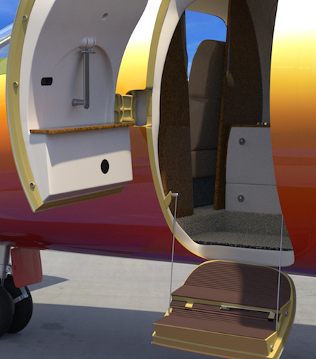
The lower ends of the support cables on this cabin door are on small spring-loaded reels within the door bottom, on the actual aircraft. To simulate that, I used a 2-point renderable curve for each cable, with the center located at the top, where they’re attached to the cabin wall brackets. Then, I added a relationship between the door open/closing channel, to control the length of the curve. Finally, I added a couple of other relationships in the “rotate x” and “rotate z” channels, to keep everything aligned as the door moves. The result is convincing, so I’m pretty happy with this method.
(I’ve deleted a lot of items, and reduced the render quality settings for this brief video, to save render time, so disregard the noise.)
More rendering tests:
I found this photo of an empty aircraft hangar online, and composited the P180 into it, with a Shadow Catcher under the plane. To get the reflections right, I set up two different Environment Items. The first one used Front Projection, and is only visible to the camera, and to refraction rays. The second one uses Cubic Projection, and is only visible to indirect rays and reflection rays. I increased it's intensity to 200%, which let me eliminate all other lights and Environment materials. So, this render is lit by the images alone. This is a progressive render which I let cook for about 6 hours, until the noise was removed.

The environments for the render below were set up the same way as above, but there was a directional light added to cast shadows, and an Environment Material added to the Cubic-mapped Environment, to brighten the scene. (I didn't create the two female models. The are modified versions of some free downloads, which came from archibaseplanet.com several years ago.)
Most of the P180's you'll see have the basic white base color, with some subtle stripes along the length of the fuselage. I may do something like that, but since it's so typical, I'm leaning toward something with a bolder look, and lots of color.

Some flashy paint, done in a unique way...
One of the most tedious tasks still remaining on this project is to create a LOT of small text labels for the individual switches and knobs in the cockpit. It’s going to be gratifying when complete, but it won’t be “fun”. So, I’ve decided to do something that IS fun… some exterior painting on this model…
The typical real-world corporate-type paint for this aircraft is simple and elegant, consisting of the base white color, with three flowing stripes running the length of the fuselage and tail. That’s easy, but I wanted to create a more flashy, colorful scheme, as though I own the aircraft, and was having fun with it. So, I decided on a red/orange/yellow gradient-type color scheme for the fuselage, along with some stripes.
But…
This aircraft is split up into many parts, as you’ve seen earlier in the project, including several different fuselage sections, separate wing and foreplane fairings, landing gear doors, cabin doors, other vents and intakes, etc.. The other issue is that I still want the flexibility to display the structure in it’s raw metal form, in it’s primer color, and with a transparent skin, so I can show the structure. After some testing, I found a way, which gives me a huge variety of choices.
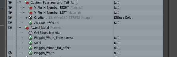 Have a look at this super simple setup in the Shader Tree. With all of the individual colors defined lower in the Shader Tree, there are only two masks required to control everything I need. The top one (“Custom_Fuselage_and_Tail_Paint”) is the exterior paint, the one below it (“Avanti_Metal”) controls everything else.
If I toggle the “Custom_Fuselage_and_Tail_Paint” mask off, I can simply toggle the masks on and off in the layer below (“Avanti_Metal”) to depict the model with it’s overall base white metal color, in a painted “primer” color, or an unpainted “Steel” color. By toggling the masks just above that, I can make the outer skin transparent, and if I like, I can add the Cel Edges material to add a bit of definition to the transparent skin seams.
If I toggle the “Custom_Fuselage_and_Tail_Paint” layer back on, I can then show the gradient color scheme and adjust it, and include both the stripes and other markings. Here’s how that mask was set up.
I went through the model hierarchy and selected all the exterior polygons in the fuselage and tail that I wanted to paint, and created a selection set. Then, in the Shader Tree, I created a new “Custom Paint” group, pointing to that selection set. For the colors, I used an instance of the base material, with a gradient above it, set to “Y distance to locator”. I then rendered an orthographic side view of the model, and in Photoshop, used it as a reference for creating the “stripes” layer, which is applied as a simple X projection. The stripes are acting as a mask for the gradient, so that the base color shows through. The N numbers on the tail are also an X projection, and the personalized signature on the cabin door is a “local” polygon selection on the cabin door with a standard UV map.
This method provides some advantages, and a lot of flexibility. For example:
- It’s simple to maintain and adjust. The “permanent” markings, which would be the same on any version of the aircraft, such as the N number, warning placards, etc., are on separate UV maps or projections from the color, so they’re not affected if I change my mind about the “paint”.
- As an example - If I wanted to change the gradient colors from the audacious scheme here to a “business-type” grayscale gradient, it’s a simple matter of adjusting a few keys in the Gradient Editor. Like the stripes, the gradient and the N numbers flow smoothly across all the surfaces, with no worries about UV seams. And since they're projections onto a selection set, rather than onto a "part", they work perfectly when the rudder and it's trim tab are animated.
- If I want to make the stripes another color, all I have to do is change the base material in that group to whatever color I want. Another nice thing about using a selection set for the stripes is that they fit perfectly, across all the different surfaces, with no distortion whatsoever, without any UV maps. Note for example, that because I used a selection set, the stripes on the cabin door “break” perfectly around the opening for the door handle, the various fairings, etc..
- Other markings can be freely added, either as masks (like the stripes) or as local UV maps on those parts of the geometry. (like the signature on the cabin door)
The renders shown here are unclamped. (I didn’t model the two females. They are modified from some free downloads which came from archibaseplanet.com several years ago. I included them “for scale”.) Although compressed in your browser, these renders are all 1920 pixels wide, so just drag them to your desktop to see them in full resolution.
NOTE: I really like these results, and their versatility. But... At this moment, I've only got this working for static poses. When the model is moved, the gradient, and the "stripes" mask driving it don't move correctly with the rest of the hierarchy. This is probably because the texture is pointing at a polygon selection set, rather than a UV map. I'm working on this, and have also posted the question on the forums, so as soon as I have the answer, I'll add it here. If a simple solution can be found to this problem, then this is a method I'll be using a lot in the future. Stay tuned!


Procedurals give LOTS of paint options, with very little effort.
My favorite aspect of procedural shading for a project like this is the versatility. All of the color schemes below can be shown by just turning on or off various material groups, with no need to worry about UV maps. In fact, the only UV map on the exterior at this time is the "Mike James" log on the cabin door. The first scheme shown below uses the white "Avanti metal" base, with projections for the stripes and N numbers. It would be very simple to change the base color to anything else, and the stripes image, which is a single color, could also be easily changed.
The gradient-style scheme uses the stripes image as a mask for the gradient layer. (So, I could change the color of the stripes by simply changing the base color. Then, by simply copying the custom gradient material group, and editing the gradient, I have access to a variety of color schemes, from "flashy" to conservative. Here are some examples...


And finally, (below) a version with a completely transparent skin.
Click the "Page 06" link below, to continue on to the internal control system.